Something we feel strongly about at Nextgenediting
is the use of computational biology to support and contextualise the
main experimental findings of a biological paper. There is a wealth of
primary research that can be performed before you even get started doing
your experiments in the lab, and the best papers know how to make the
best use of it. These data can be particularly useful for grant
applications, too. We sometimes send recommendations back to our
biomedical authors saying ‘go to GEO
and analyse this dataset - you have all the information available to
you tell you exactly what the expression of your gene of interest is in
thousands of breast cancers…or colon cancers…or cardiovascular
patients….or whatever your disease of interest is’. When you take this
approach you often find the experiment you were planning (in vitro or in vivo)
has already been performed, or there is supporting mouse data, or often
clinical data. They can be used to generate the first figure(s) of the
paper, put the experimental data in clinical context, and save a huge
amount of time and effort performing costly -omics experiments. If you
don’t know how to use these resources or need more information, please contact us.
What we hadn’t realised until very recently was that the same can be done for epidemiological data. We are currently planning our Nextgenediting Global Initiative (for more information click here), and while researching health and income statistics of third-world countries we found the World Bank World Databank. This is a free, online database of Development Indicators, Gender Statistics, and other useful data, which you can mine and interrogate at will for hundreds of different countries - both developed and otherwise. Most exciting for us however, is the Health, Nutrition, and Population Statistics Database which allows you to mine health and disease-related data. You just choose your country or countries of interest, the data series you want, and the range of years you are comparing (from 1961 to present) and the results are presented as tables, graphs, or on a map. You can even download the raw data and work with it yourself to present your own graphs or figures. Truly amazing.
We remember feeling like this when we first realised we could get our hands on raw gene expression data. What a powerful tool to contextualise your own work.
So if, for instance, if you are doing a study on HIV, and you need to know what the AIDS death rates are in various African countries, it would take two minutes to get this chart:
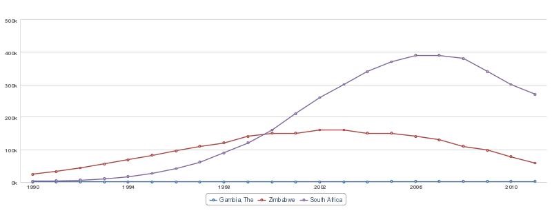
which you can then fully customise. So much better than some outdated and over-cited WHO data, don’t you think? You can then get a first-hand grip on the numbers, trends, and associations relevant to your own research.
What we hadn’t realised until very recently was that the same can be done for epidemiological data. We are currently planning our Nextgenediting Global Initiative (for more information click here), and while researching health and income statistics of third-world countries we found the World Bank World Databank. This is a free, online database of Development Indicators, Gender Statistics, and other useful data, which you can mine and interrogate at will for hundreds of different countries - both developed and otherwise. Most exciting for us however, is the Health, Nutrition, and Population Statistics Database which allows you to mine health and disease-related data. You just choose your country or countries of interest, the data series you want, and the range of years you are comparing (from 1961 to present) and the results are presented as tables, graphs, or on a map. You can even download the raw data and work with it yourself to present your own graphs or figures. Truly amazing.
We remember feeling like this when we first realised we could get our hands on raw gene expression data. What a powerful tool to contextualise your own work.
So if, for instance, if you are doing a study on HIV, and you need to know what the AIDS death rates are in various African countries, it would take two minutes to get this chart:
which you can then fully customise. So much better than some outdated and over-cited WHO data, don’t you think? You can then get a first-hand grip on the numbers, trends, and associations relevant to your own research.


Post a Comment
Thanks for reading my blog.
Note: only a member of this blog may post a comment.